Graphics play a role in our Internet learning experience. Images have become part and parcel of the information acquisition process in our lives. Normally, graphics like pictures and drawings are used as aids and not the main tool for learning. They are just appendices that help people understand the information that is being fed to them.
That was the general idea before the influx of the Internet. The pre-Internet idea is dominated by the belief that graphics are just ‘aids.’ But it has surprised learning purists that graphics can be very good tools as main information sources. Thanks to the Internet, we now have Infographics!
Infographics or information graphics are visual and artistic representations of data or knowledge. They are presented in a creative, quick and witty manner using diagrams, charts and design elements. Infographics are filled with drawings, vector and flat-design images, sketches, icons and texts to facilitate the learning experience better and more fun.
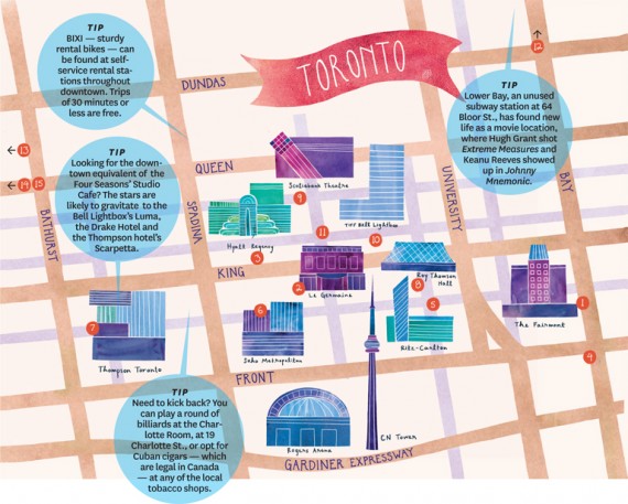
The average tourist can quickly and, with fun, go through the city using an infographics-designed map, or take researching student who could quickly grasp the use of colors for advertising.
The first thing you take note when making an infographic is the info. That is elementary knowledge. Information, which comes before the graphics, should be correct, interesting and relevant. The graphics would totally fall and suck if you’re data is as intelligent as Patrick Star.

So how do we find intelligent data? Consult Einstein or Stephen Hawking? That would be a very good idea. But since most of us are ‘busy’ enough to even stand up and remove ourselves in front of our own computer tables, we might as well make the most out of what we have. We could browse blogs that provide us with relevant data, tweets, books, or we could just Google things out!

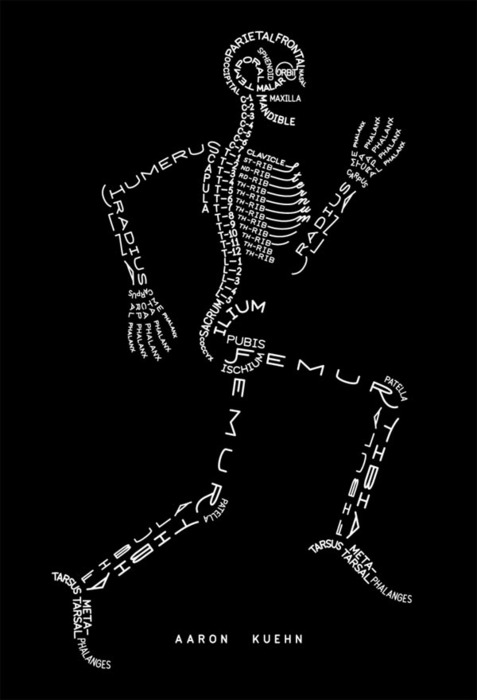
Okay, this part isn’t anatomy; you’re still at 1stwebdesigner. The skeleton is just a step in making an eye-gasmic infographic. This is the part where you need to arrange the data you have collected into an organized story or flow. Each datum must point to another and so. The rule of thumb in infographic-making, there should only be six main points or parts as a maximum. You should determine these six parts. You need to list six of the best and most interesting facts you have. The trick here is, if a data bores you, it will bore everyone. If it entertains you, it will still bore everyone, so you might as well look for a better one. This will ensure sustained interest and readership and would not result into brain explosions due to information overload.
Once arranged, the data must be represented in a visual format. It is very advantageous to make an outline and think of the needed graphics for your work. You also need to process data and make them graphs, flowcharts and comparisons. Remember that a good organization is as good as the design itself. If your data is as peaceful as Syria, try again. Make them as easy as possible to understand.